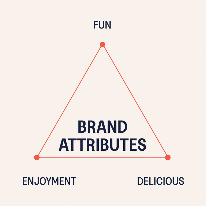
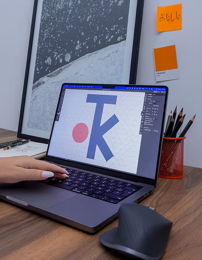
Client Overview

Tokyo Kitchen was imagined as more than just another restaurant—it was designed to evoke the warmth, joy, and playful spirit of Japanese culture. We aimed to create a brand that felt comforting, authentic, and engaging, like sharing a bowl of ramen with friends or flipping through a beloved manga.

Challenge

Our challenge was capturing intangible feelings—shared laughter, anime nostalgia, and deep-rooted traditions—into a tangible, cohesive visual identity.

Our Solution

We developed a bold yet simple logo merging chopsticks with the initials "T" and "K," accompanied by the iconic red circle from Japan's flag. We chose vibrant, energetic colors and playful illustrations of characters enjoying sushi and ramen, bringing Tokyo Kitchen’s identity to life across menus, billboards, and business cards.

Outcome

Tokyo Kitchen became more than just a restaurant concept—it emerged as a memorable, inviting brand experience. The visual identity resonated deeply, blending culinary excellence with playful nostalgia, enhancing both our creative process and storytelling capabilities.

Tokyo-kitchen-illustrations
Tokyo-kitchen-Menu
Business-card-Tokyo-kitchen
Girl-Sushi
Billboard-Tokyo-Kitchen

Ready for more?